
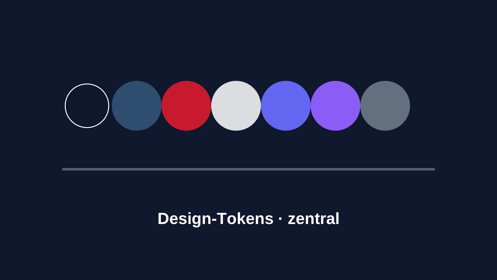
In 2026, design systems are no longer optional — they are required. But many teams fail not at the concept but at the execution: tokens live in Figma yet are hard-coded as hex values in code. Design changes do not propagate to the product automatically. After six months, the drift is so large that nobody knows which color is "correct" in which context anymore.
The defining question: how do tokens get into CSS?
There are three common approaches:
- SCSS variables: tokens are compiled into SCSS variables at build time. Downside: no runtime theming. Changing colors at runtime means a rebuild.
- JavaScript design tokens: tokens are exported as a JS object and applied via CSS-in-JS. Downside: performance, a complex tooling chain, framework lock-in.
- CSS custom properties: tokens are set as
--brand-primary: #0F182Dand referenced everywhere viavar(--brand-primary).
We chose approach 3. CSS custom properties are now supported in all relevant browsers, allow runtime theming, are framework-agnostic, and have no build-tool dependency.
Our token schema
For each brand we maintain a brand.json with the following structure:
{
  "colors": {
    "primary": "#0F182D",
    "primaryStrong": "#C8192E",
    "secondary": "#2F4E6F",
    "secondaryStrong": "#000000",
    "surface": "#ffffff",
    "surfaceAlt": "#f4f6f9",
    "text": "#0F182D",
    "muted": "#647080",
    "custom1": "#6366f1",
    "custom2": "#8b5cf6"
  },
  "theme": {
    "radius": "8px",
    "radiusSmall": "4px",
    "spacing": "1rem"
  },
  "typography": {
    "fontSans": "Inter, sans-serif",
    "fontDisplay": "Space Grotesk, sans-serif"
  }
}
A build step turns this into a brand.css with CSS custom properties:
:root {
  --brand-primary: #0F182D;
  --brand-primary-strong: #C8192E;
  /* ... */
  --brand-primary-a10: color-mix(in srgb, #0F182D 10%, transparent);
  --brand-primary-a50: color-mix(in srgb, #0F182D 50%, transparent);
}
The derived values are interesting: alpha variants (-a10, -a50) are generated via color-mix. That saves us from maintaining every transparency level by hand.
The ct- prefix: component tokens
In styling itself we never use raw tokens. Instead there are component tokens with the prefix ct-:
.c-button[data-variant="primary"] {
  background: var(--ct-button-primary-bg, var(--brand-primary));
  color: var(--ct-button-primary-text, #ffffff);
}
The benefit: if a brand needs a different button style, it overrides --ct-button-primary-bg — without changing --brand-primary globally and accidentally affecting other components.
The editor speaks the same language
We built the content editor so the color picker shows token names directly (ct-primary, ct-secondary-strong) rather than hex values. That prevents editors from accidentally entering non-token colors.
In the stored content this becomes e.g. { "bg": { "type": "color", "src": "ct-primary" } } — the renderer resolves it at runtime against the current brand.css. A brand switch on the same page would, in theory, be possible.
Lessons learned
- Freeze the token schema early. Renaming later is painful because it goes through the entire content base.
- Don't maintain alpha variants by hand.
color-mixis more powerful than any manually defined palette. - Typography tokens too. Font sizes, line heights, letter spacing — if it can be a token, make it a token.
- Make exceptions explicit. When a brand needs something different in a button, do it via a component-token override — not via selector specificity or class multiplication.
Outlook
The next topic is motion tokens: maintain animation durations and easing curves centrally so all components share the same "voice." Less commonly relevant than color and typography, but for premium-oriented brands it makes a visible difference.